

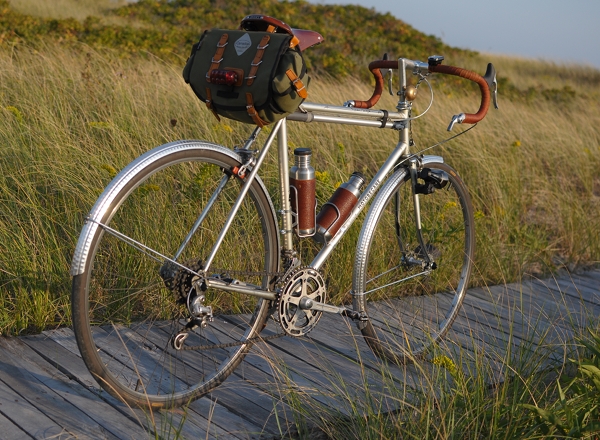
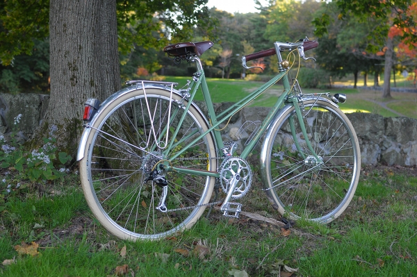
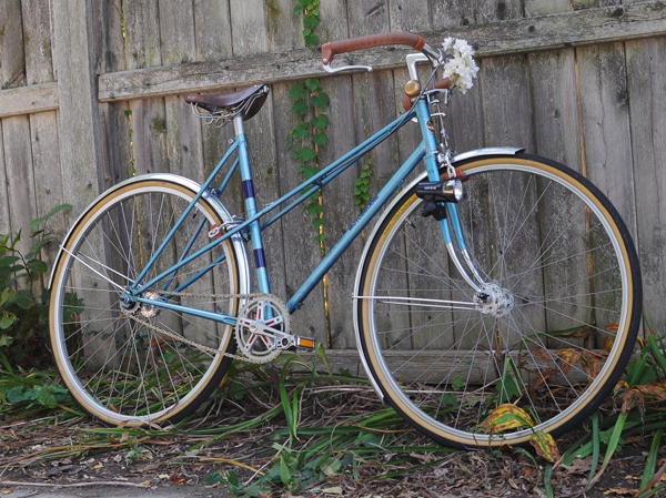
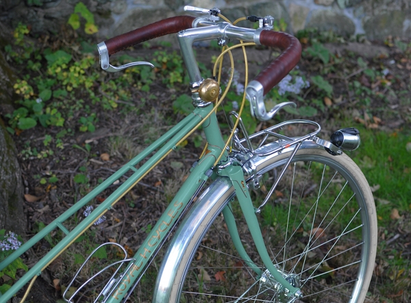
My go-to standard for handlebars and saddles is the brown family. The reason I like to use brown as opposed to black, is that brown enhances the colour of the bicycle frame, whereas black tends to "deaden" it. Being neutral, brown will not compete with the frame colour, just as black will not. But it will make the colour more vibrant, more emphatic - whereas black will leave it flat.

And when it comes to racing bikes, an aggressive or sporty look is usually more fitting than an "earthy" look. This can be achieved either with black, white, or brightly-coloured saddle and tape combinations (ideally in a contrasting colour to the frame). Bright and high-contrast colour schemes are exciting and suggest high energy, fast movement. If that is what you want your bike to communicate - go with it. And if not, you can tone it down with browns and neutrals, as I have done to this bike.
Tires
It goes without saying that performance and not colour should be the first consideration when it comes to tires. But assuming that you can get equally well-performing tires in a variety of colours, it can be nice to play around with that element as well. While I do not hide my crazed preference for cream tires, I do not suggest that they are "the best" option.Cream tires can look elegant if you are going for a delicate look and have taken pains not to include any black on your bike. Here they make the bicycle look a lot more "serene" than had I used other tire choices.
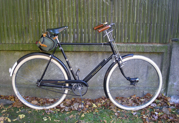
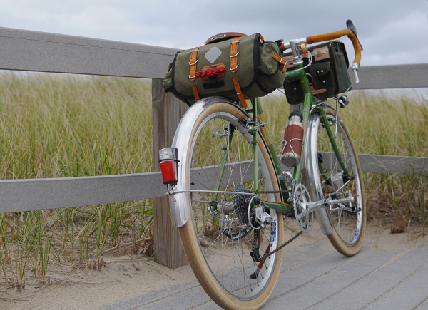
I am very conservative when it comes to bicycle "luggage," so perhaps I am not the best person to ask about this one. Mainly, I don't like it when bicycle bags are too distinct in relation to the bicycle itself - whereas the trend now (especially for accessories targeted at women) seems to be brightly coloured luggage with prominent graphics. It's not that I am "against" flowers, polka-dots, curly-cues, and the like. It's more that I want my bicycle to be the main focal point and not the bag. So I prefer to get subtle, classic accessories in neutral colours. As with saddles and handlebars, I think that the brown/olive family works well for a nature-exploring sort of look, whereas black works well for a more aggressive or racy look.
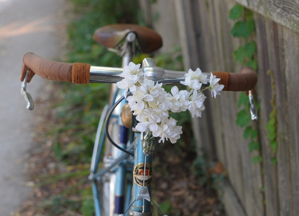
Unless intentionally using decorations to distract from the rest of the bike, the colour of the decorations should not stand out too much from the other colours on the bicycle. Otherwise, the eye will get drawn to the decoration itself, with the rest of the bike an afterthought.
If you are getting a bicycle frame re-painted, or are trying to choose a colour for a custom bike, the colour selection is of course a matter of personal preference. But based on my own experience (and conversations with others), keep a few things in mind:
1. Speaking very generally, super-bright colours work better on sporty bikes, whereas subdued colours work better on touring and transportation bikes.
2. True white is very harsh and almost never looks good. Even if a bicycle you like appears white to you, the actual colour is almost definitely a pale cream, a very light gray, or an off-white. Think twice before asking for a true white paintjob.
3. If you are getting the paintjob (especially powdercoat) done at a "budget" type of establishment, beware of asking for metallic colours. They are easier to mess up, and flaws in them are more visible than with regular colours. Flaws in lighter colours are also more visible than flaws in darker colours.
4. Prepare yourself for the fact that the colour never, ever looks the same on the bike as it does on the tiny colour chip, let alone on the online colour sample. I have seen some pretty amazing discrepancies, where after the person spends a month wringing their hands about the "perfect" shade, the colour on the bike does not even look like the same colour family as the chip they chose. One thing you can do, is give the painter a sample of the colour you want and ask them to find the closest match. They have experience with the way the colours actually looks on a bike. Alternatively, you can find out the colour code of a bike you like, and ask for that exact one.


0 comments:
Post a Comment